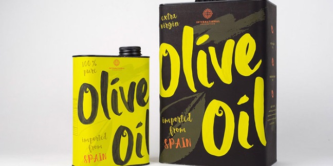
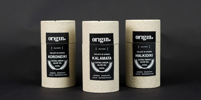
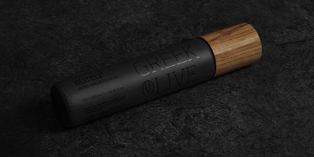
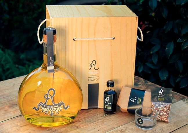
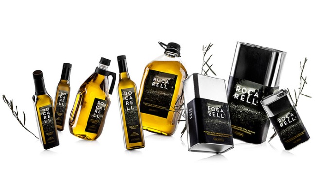
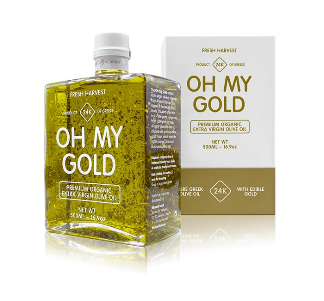
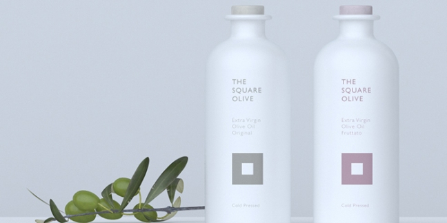
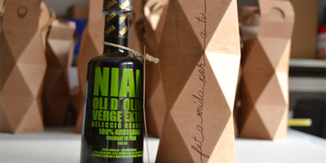
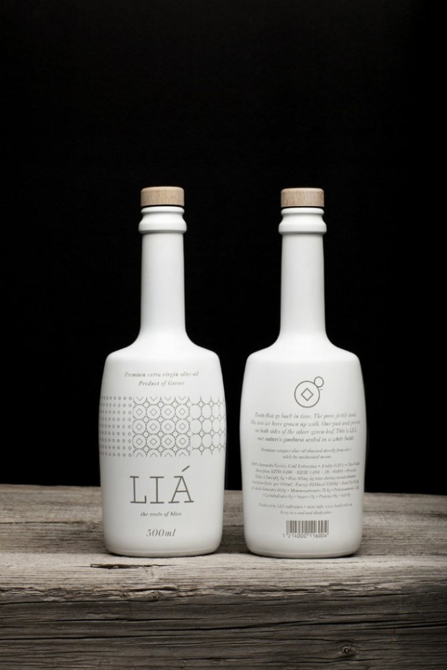
This is a packaging design for a fictional company, International Collection. The oil packaging is for 100% Pure and Extra Virgin Olive Oil that is imported from Spain. The inspiration for this packaging came from one of Spain’s most famous artists: Pablo Picasso. I wanted to emulate the brush strokes of Picasso’s “Don Quixote” painting, combined with the loose way he signs his name on his paintings.The students were asked to propose a packaging system any consumer package good. I chose to do an imaginary brand, Origin, that takes an approach on the importance and value of olive oil in greek mythology. Both Posiedon and Athena were offered the chance to impress the people of Greece and take control in the leadership. Athena was pronounced the victor by granting the greatest give to Athens, the olive tree, by striking her spear through the stone and piercing the ground.Located in picturesque Mani, at an ideal altitude and embraced in a unique microclimate, our estate lies terraced in a nutritious and rich in organoleptic ingredients sloppy and rocky terrain nourishing our mature Koroneiki cultivars. Unspoiled by any kind of pesticides artificial fertilizers or irrigation systems, our olives are exclusively hand picked and plucked at just the right moment. Carefully placed in crates to prevent bruising, and impart the characteristic sublimely lush taste. Shortly after they are plucked, olives are pressed into a paste and malaxed for thirty-five minutes. The oil is separated from the fruit with the help of only cold water, and maintained in controlled-temperature stainless steel tanks. No filters are used during bottling at the expense of a significantly smaller yet richer in polyphenols yield http://www.uniquegreekproducts.com/Buteli® is a small production extra virgin olive oil, exclusively from olives growing in the magnificent olive groves of Corfu. It is only sold in glass bottles 500 ml, in selected points and in exceptionally small quantities. * in the local dialect, the shop that collects olive oil is called “Buteli”. In order to improve the crop quality, the olive trees are pruned when necessary. The branches are collected and once they have been selected and processed they become caps for the olive oil packaging.IN AFRICA, SOUTH AFRICA | ANANJA TURVEY, GLASS BOTTLE, OLIVE OIL PACKAGING INSPIRATION, PLASTIC & PVC, RICO SABOR, SAUCES & OIL, SPICES | Package Design for Rico Sabor Olive Oil.Design of the label of an organic olive oil. Rocarell is an organic olive oil and it is also the type of soil of the farm land where the olive trees grow.A premium product line, of unprecedented quality, infused with edible gold. Container selection and typographic treatment, were inspired by the highly coveted gold bars. The unpretentious name that we created for this series, is a neologism addressing admiration, excitement and wonder.dentity and packaging design for The Square Olive. The logo and naming are a playful twist on the shape of an “olive”. This was strategic, so as to make the product, company and logo memorable. Along with a contemporary clean design that represent the purity of the product, the colours were carefully chosen to invoke a sense of connection to the product, the olive tree and to the earth itself.The package It’s inspired in Gaudí Architechture forms and it contains a bottle of exclusive extra virgin olive oil from the lands of Catalonia.Brand and packaging design for LIA extra virgin olive oil producing company. The logo refers to the traditional way and means used to produce olive oil. Multiplying the logo creates a pattern, also used to decorate the packaging, that resembles ways used to decorate objects in older eras, bringing out the place’s great cultural history.
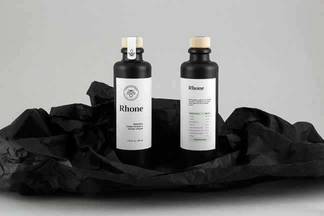
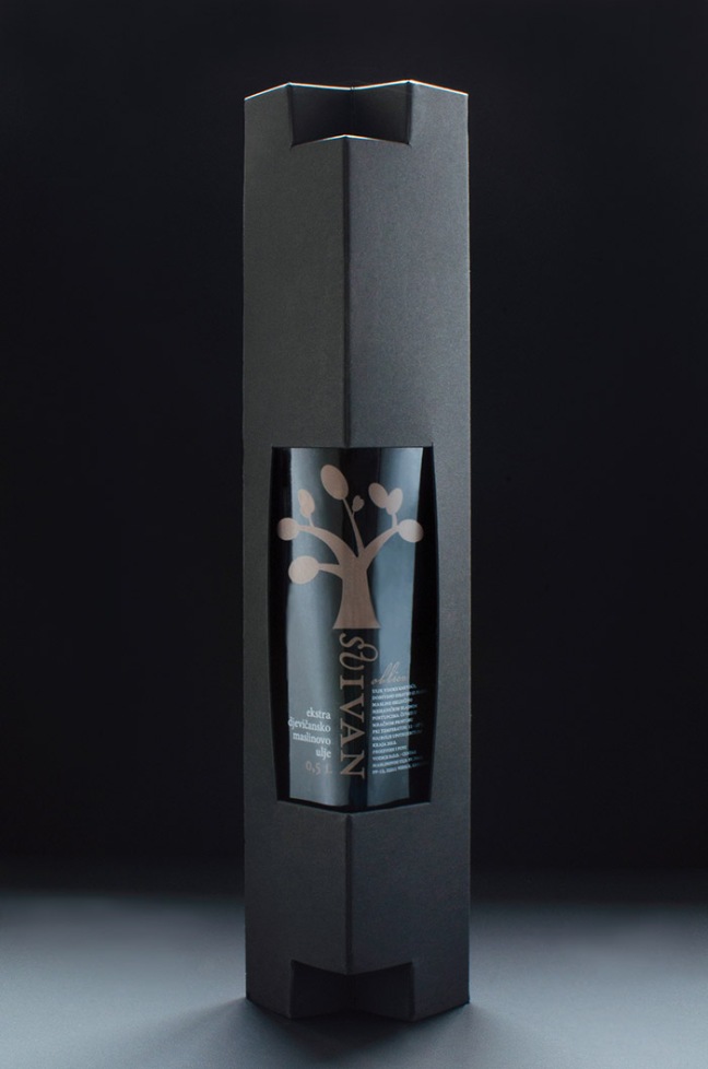
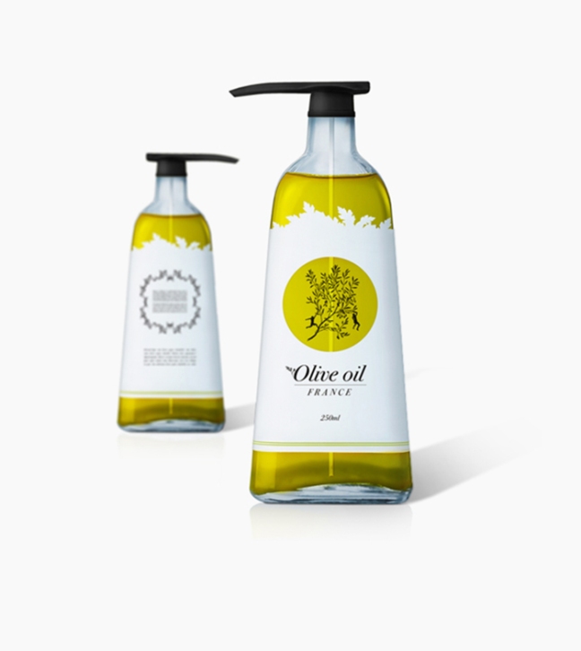
Rhone is a fictional premium olive oil. The packaging is reduced to the essentials and attracts attention through the unusual monochrome contrast. Rhone embodies pleasure and joy – therefore a pleasant, bright and friendly image world was created.Visual identity and packaging for a new brand of extra virgin olive oil. The task was to distinguish the products as premium quality in a cost-efficient manner. Since the bottle was predetermined and is commonly used by other oil producers, the label is unconventionally positioned and the supplementary box is designed according to it. Made from paperboard, the box has an unique locking system, which is used as elevation pilars for the bottle. The combination of typographic style, illustrative identity, colour coding and the box with a sculptural feel to it, make this design elegant yet affordable.DESIGN PROCESS OLIVE OIL: I have designed an olive oil with a pump so you do not mess up in the kitchen. The idea was keep the bottle functional but also look stylish and inviting. I wanted to keep the the label clean to add more focus on the shape of the bottle and therefore I only used black and white, also because it follows in the graphic profile. I wanted to take advantage of the contents of the bottle so I highlighted that with a punching and a illustration.